Project Overview
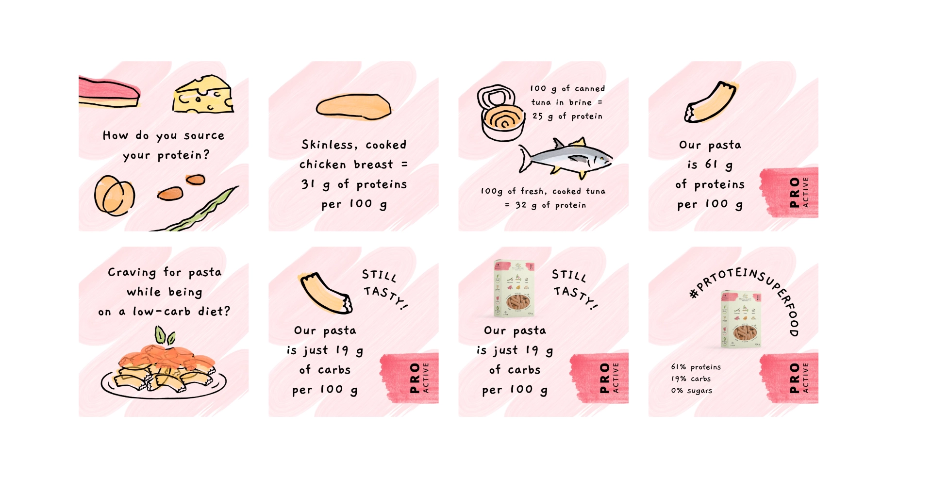
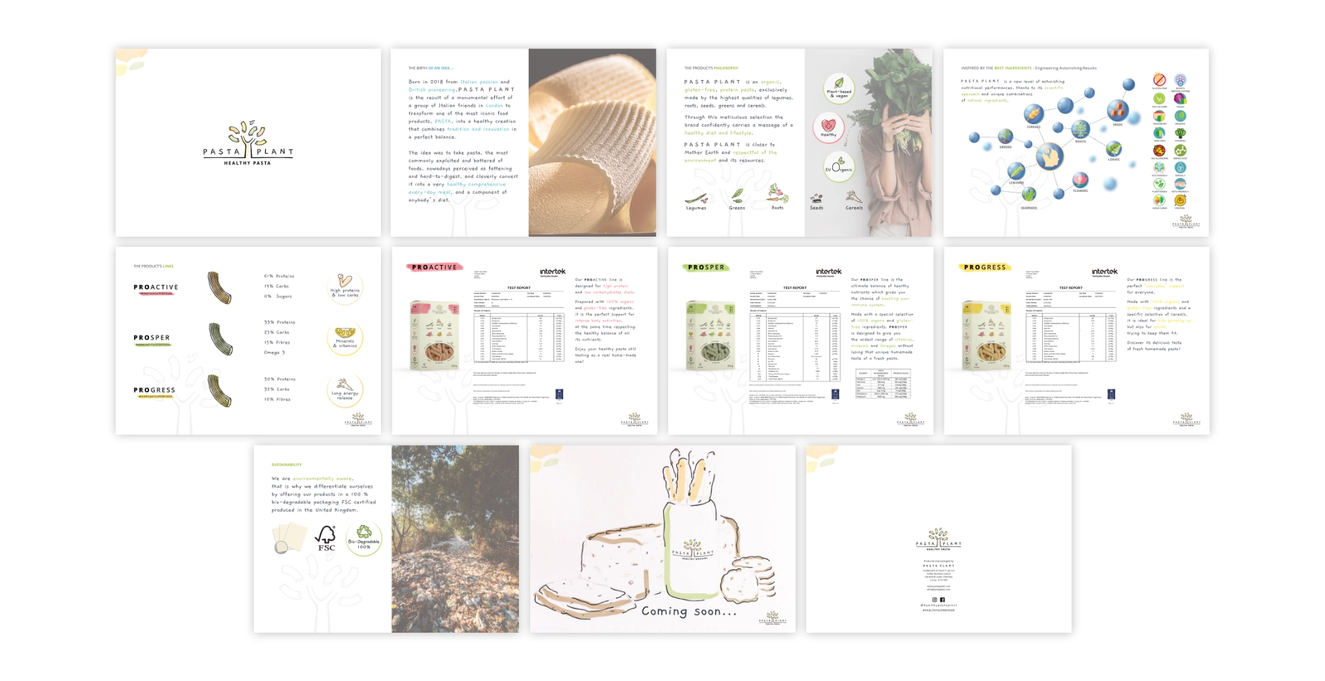
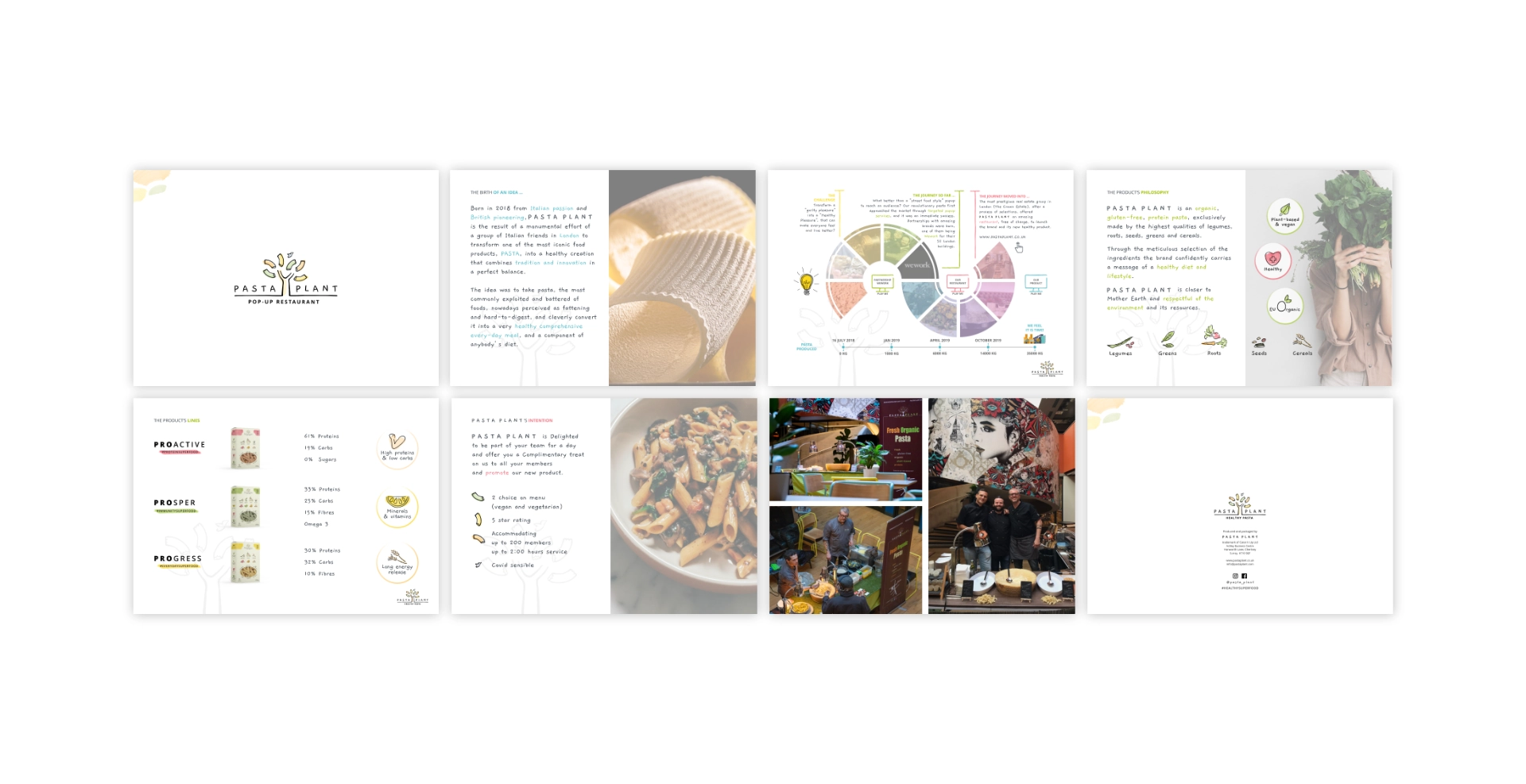
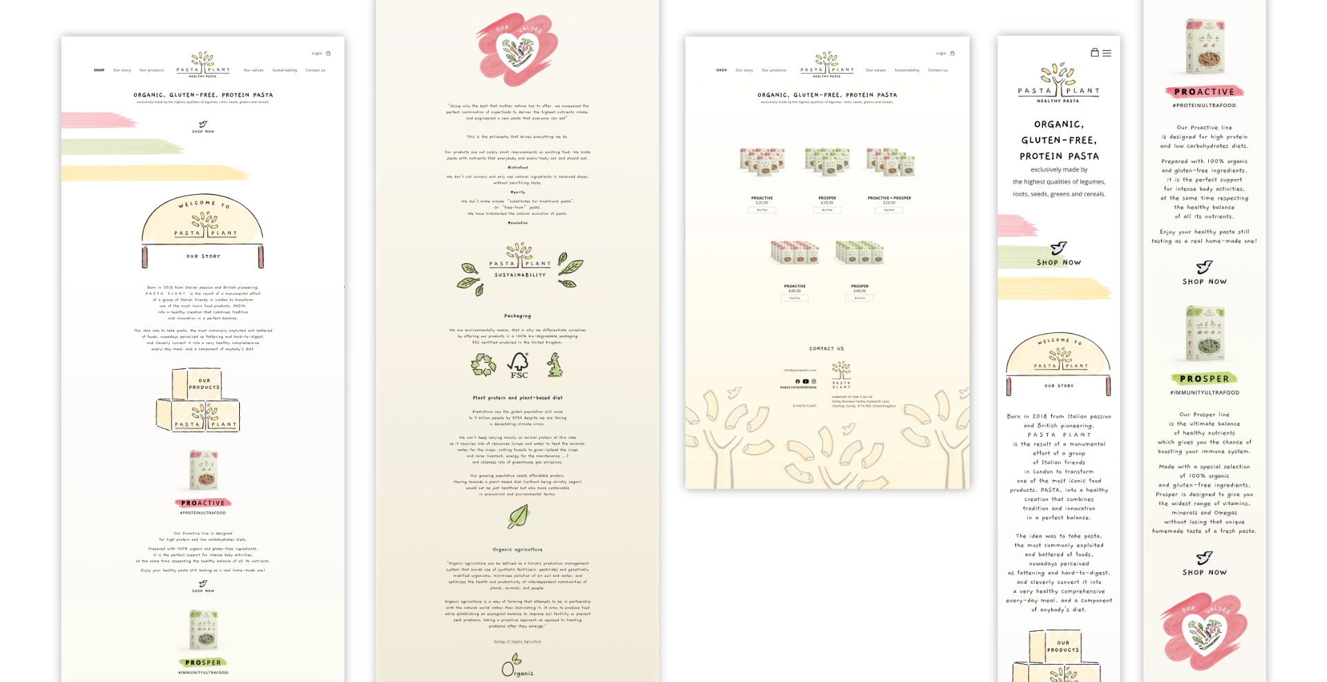
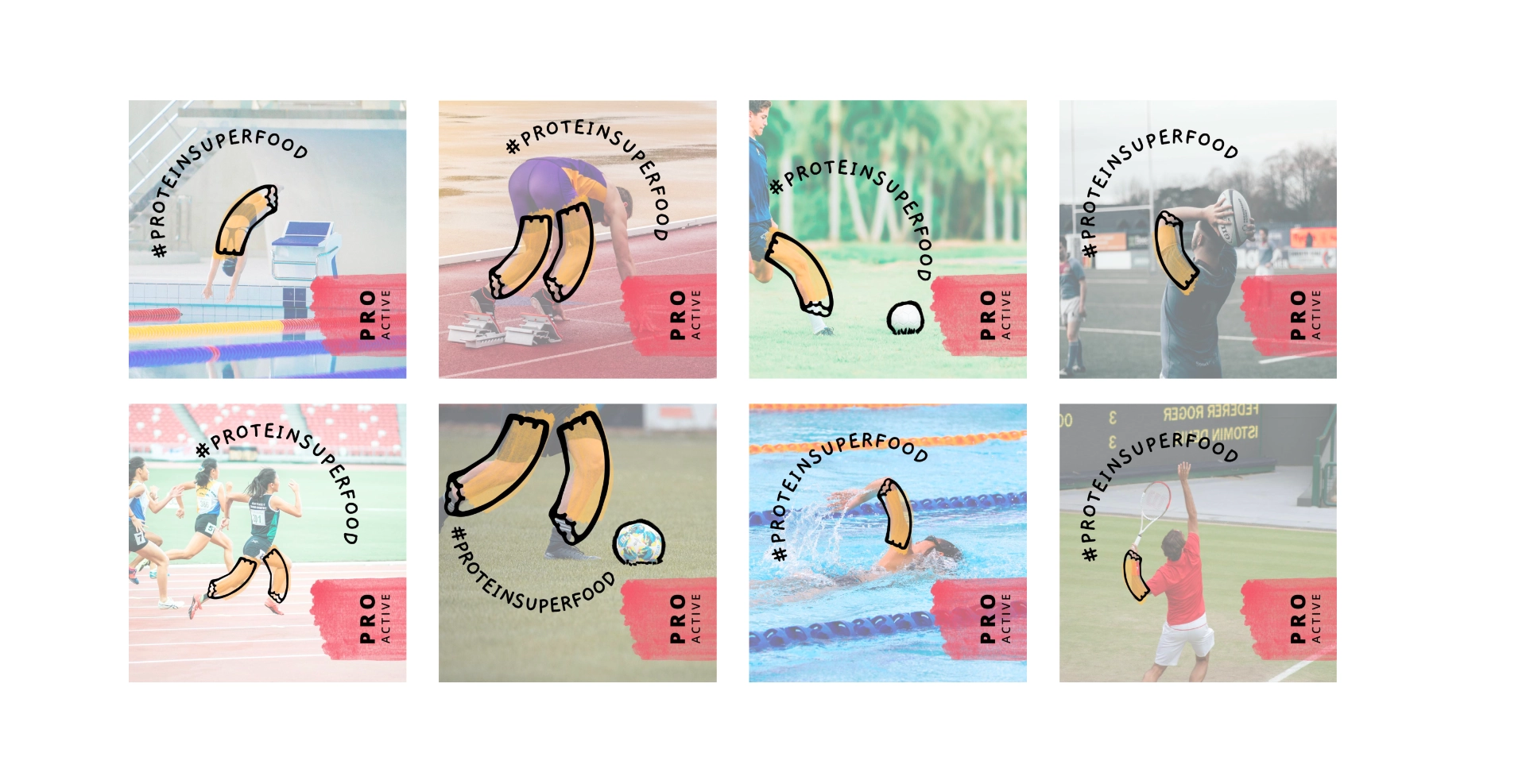
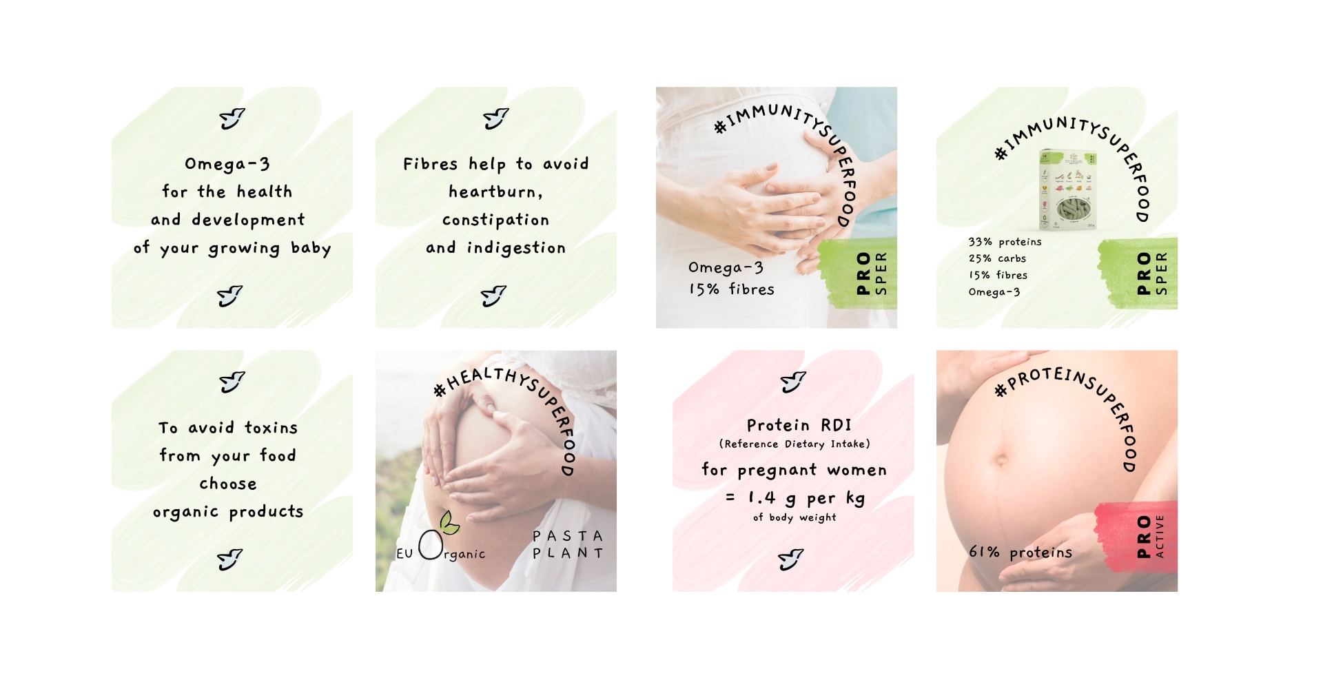
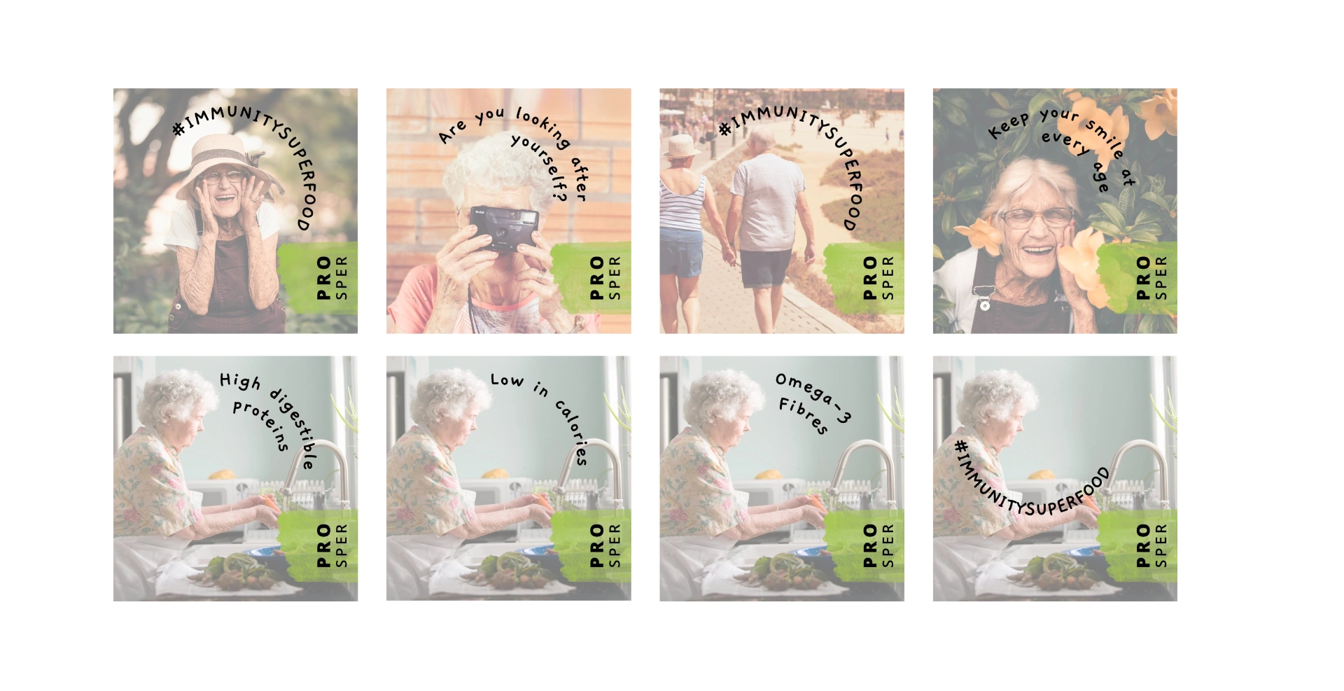
Pasta Plant is a food brand identity design project developed from the ground up for a London-based organic pasta start-up. The brand set out to make healthy eating genuinely exciting. Their range of organic, gluten-free pasta used high-quality legumes, roots, seeds, and greens. As a result, it offered a protein-rich alternative to conventional pasta, without compromising on taste or nutrition. The brand aimed to carve out a distinctive space in a competitive health food market. Its target audience included sportspeople, vegans, health-conscious eaters, people with dietary intolerances and pregnant women.
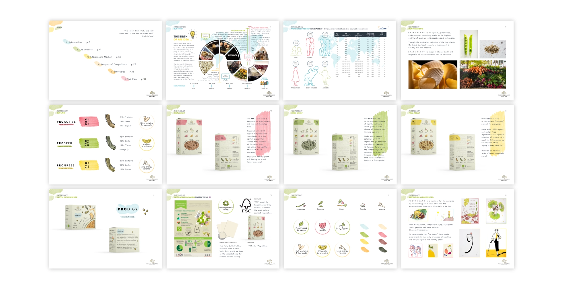
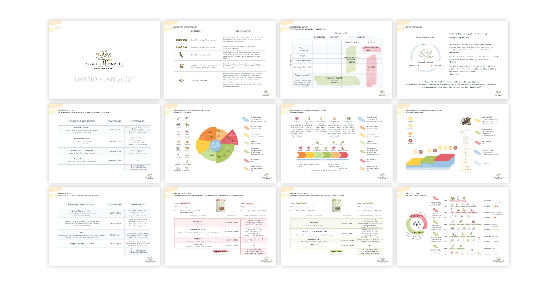
In 2020, I was brought on to build the brand from the ground up. The scope was one of the most comprehensive I have undertaken. It covered brand strategy, visual identity, packaging, print, digital, and motion. Although Pasta Plant stopped trading after struggling to secure further investment, the project remains a significant milestone in my practice. It deepened my understanding of start-up culture, retail positioning, and the full journey a brand takes from concept to shelf.
The Brief & Design Challenge
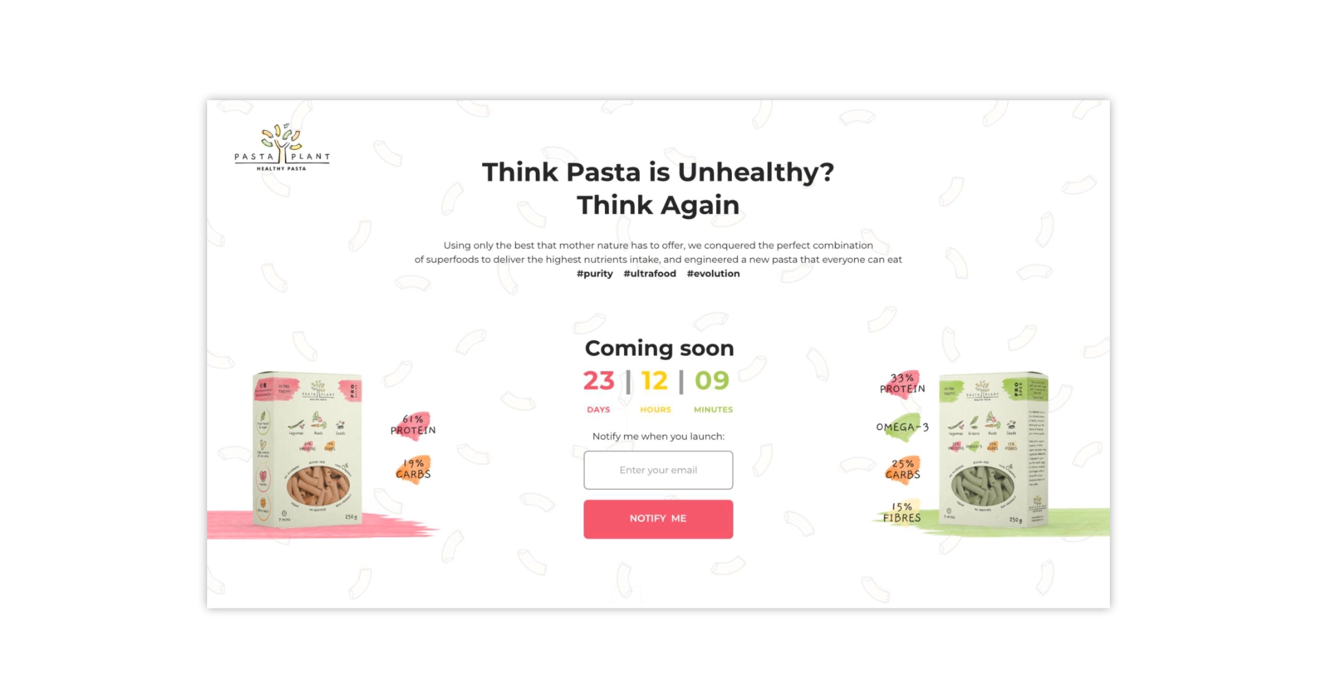
The challenge had two parts. First, to create a brand identity that felt premium and purposeful, one that could hold its own on a health food shelf alongside established names, while clearly communicating the product’s nutritional credentials. Second, to build an entire brand ecosystem from scratch, giving the founders the tools to pitch to investors, engage retailers, and connect with consumers.
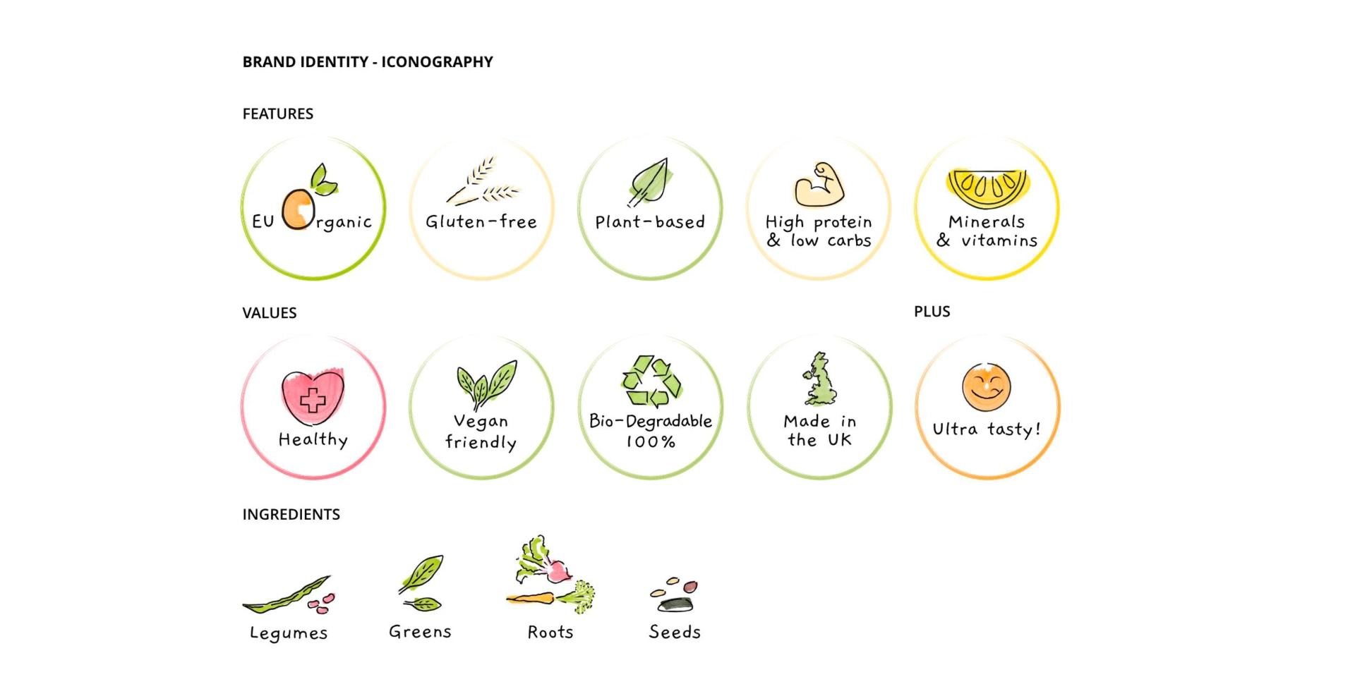
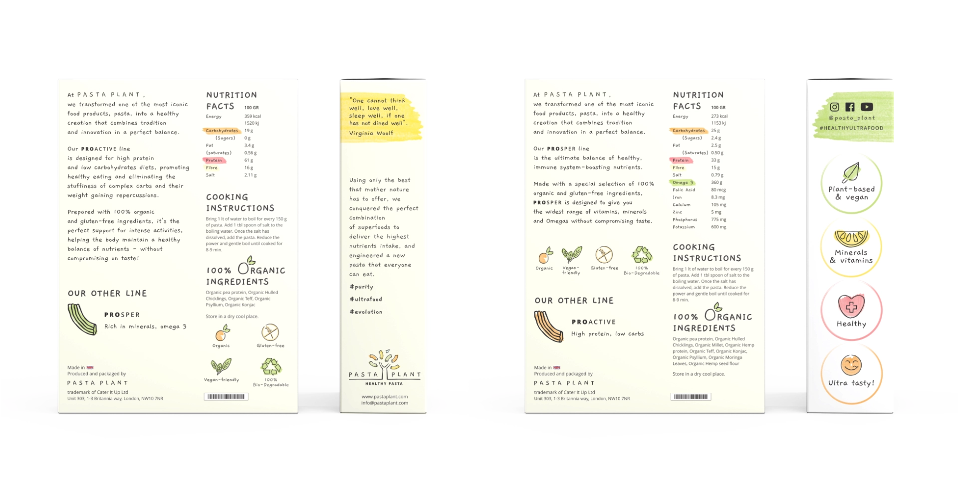
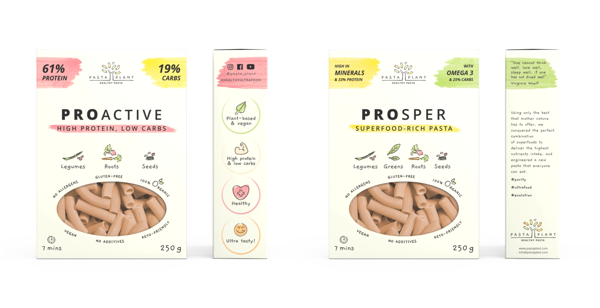
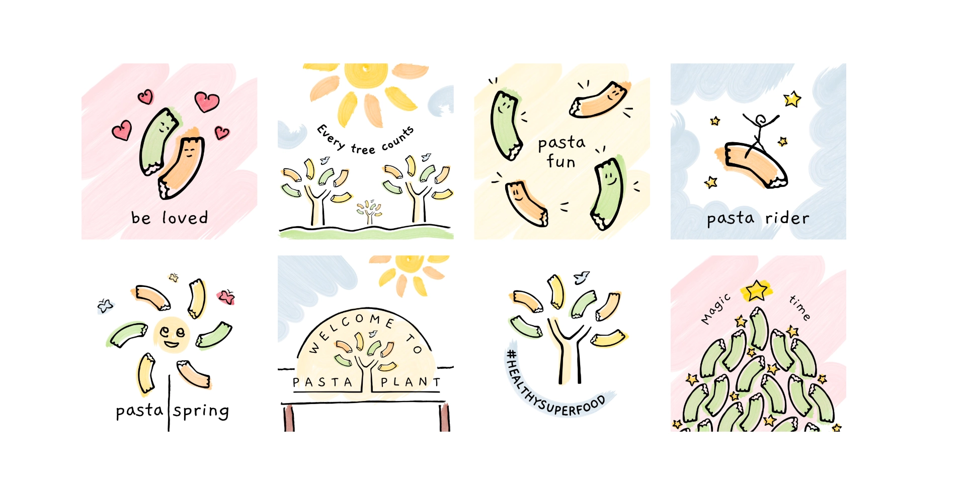
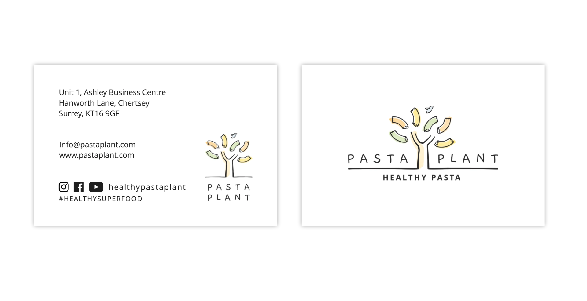
Since the target audience was broad, the visual language needed to feel inclusive and approachable. At the same time, it had to be vibrant enough to attract a health and fitness-savvy crowd. To meet this, I developed a warm, nature-inspired identity rooted in hand-crafted illustration, expressive watercolour ribbons, and a refined logo that balanced warmth with credibility.
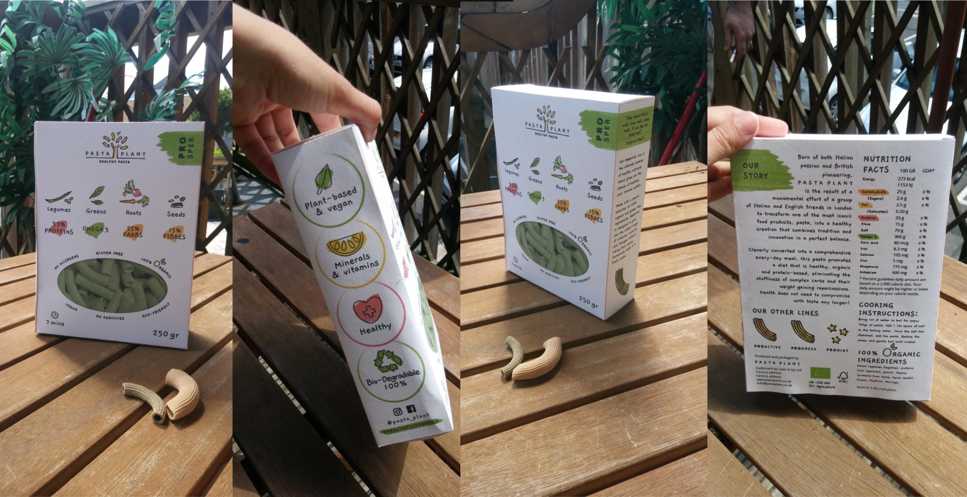
It is worth noting that before launch, the client made some adjustments to the packaging, including changes to the copy and the removal of the pasta window. However, the logo, illustrations, and watercolour ribbon system were all retained. The version shown here reflects the original design as delivered.
Impact
Despite not reaching mass retail, Pasta Plant gained meaningful traction. The brand secured press coverage and built partnerships with health and fitness influencers whose audiences matched the product closely. Furthermore, it found a place on the shelves of several London-based independent health food shops and was presented at trade shows, where the identity held its own in a fast-moving category. Without sufficient investment to scale production, the pricing became difficult to sustain against well-funded competitors, and the path into mass retail proved out of reach.
Personal Reflections
This was the most ambitious brand identity design project I have been part of. It spanned logo development, packaging, print, digital, and motion design, all within the pressures of an early-stage business. Beyond the visual craft, I also contributed to design the investor deck, brand strategy, and retail and marketing pitch. Consequently, I developed a genuine understanding of start-up dynamics and commercial brand building. What made it particularly resonant was that I belong to the audience it was made for. I follow a predominantly plant-based diet, so I brought not just professional investment to the work, but a personal one, and that connection ran through every decision.