Overview
Delapage is a UK charity that assists communities, institutions and public services across a broad range of philanthropic activity. Its work covers community infrastructure, education, Torah institutions and wellbeing. Its audience is mainly institutions and service providers within the Orthodox Jewish community.
I worked on the charity brand identity for Web Studio Lab, the agency responsible for the charity's new website.
I worked on the charity brand identity for Web Studio Lab, the agency responsible for the charity's new website.
Brief
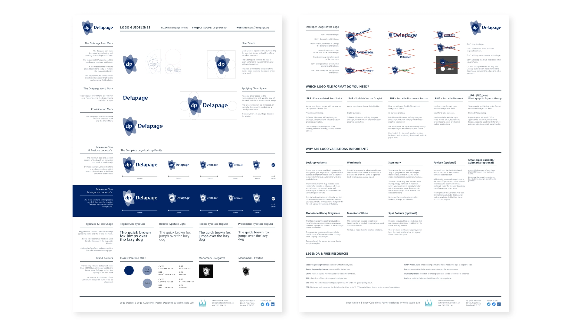
The agency needed a new identity for Delapage, including a logo, guidelines for using it, and the stationery. The identity also had to work as the foundation for the website interface.
There was no defined brand strategy at the start of the project. The brief was practical: a mark that was credible, simple to use, and could sit across many different institutions and causes. I treated that as the main design constraint.
There was no defined brand strategy at the start of the project. The brief was practical: a mark that was credible, simple to use, and could sit across many different institutions and causes. I treated that as the main design constraint.
Approach
With no positioning to work from, I started from how Delapage describes itself. It gives, helps and facilitates. It doesn't run everything directly. It supports the institutions around it. That suggested a structure with a centre and several parts moving outward from it.
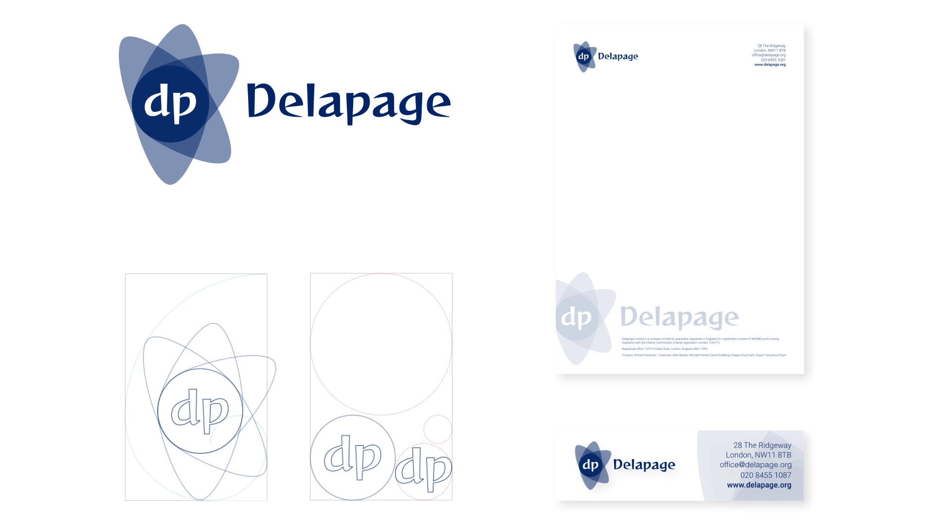
The icon is built from a single drop shape, duplicated and rotated on its own axis. Each shape is set at 50% opacity, so where they overlap the colour deepens into a solid circle. The initials "dp" sit inside that circle. The rotation gives the mark a sense of movement, and the overlap reflects the idea of partners and communities coming together. The construction was deliberate, and the proportions follow the golden ratio.
Colour: The palette is deliberately limited to one blue, used solid and at 50% opacity. A deep blue suits an organisation that institutions need to trust, and the transparency keeps it from feeling heavy.
Typography: The client chose Reggae One for the Delapage name and the initials. A more corporate typeface would have been my own preference. I kept Reggae One for the wordmark and used Roboto for all other applications, so the rest of the identity stays quiet and legible. The website titles use Philosopher.
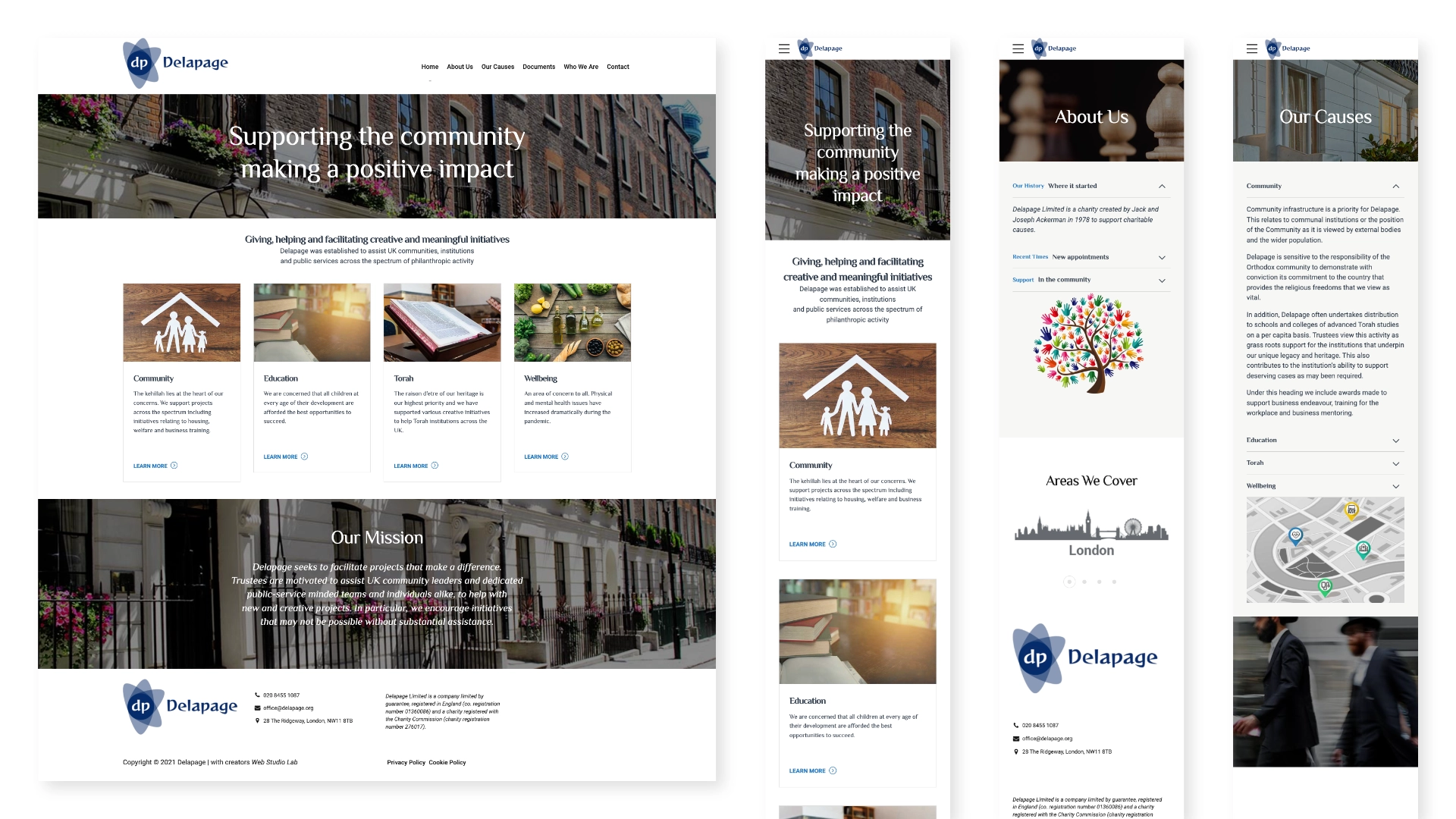
Website. I customised a WordPress template to apply the new identity: colours, typography, logo lock-ups and image treatment across desktop and mobile. I then handed the design to Web Studio Lab.
Date
2021
Agency
Website
Audience
Institutions and service providers, mainly within the Orthodox Jewish community in London, Manchester and Gateshead.
Services
Logo design, logo guidelines, letterhead, e-mail signature, website design (WordPress template customisation).